jqplot
Google Analytics APIからアクセスデータを取得し、それを http://www.jqplot.com を使ってバーチャートとラインチャートをレンダリングしてみた
その前に
Google Analytics APIなどから取得したデータをJSONとして出力出来るようにしておく。ざっくりとしたJSONデータ構造がこんな感じ
んまぁ一ヶ月間のアクセスデータのうち、ga:pagePathが^/entryなのだけをフィルタリングして取得する。カウントなどの処理はJavaScript側で行う(yearなどはga:yearをdimensionsに指定すれば取得可能)
準備
http://www.jqplot.com からダウンロードしてくる。んで展開したディレクトリ内にある
- jqplot.js
- jqplot.cs
- plugins/jqplot.barRenderer.js
- plugins/jqplot.categoryAxisRenderer.js
- plugins/jqplot.pointLabels.js
- plugins/jqplot.highlighter.js
をコピる、もしくは展開ディレクトリをそのまま移す。今回は上記のファイルのみ使う。当たり前だけど、jQuery本体は(ry
report.html
<html>
  <head>
    <meta http-equiv="Content-Type" content="text/html; charset=utf-8" />

    <script type="text/javascript" src="/static/jquery.js"></script>
    <script type="text/javascript" src="/static/jqplot.js"></script>
    <script type="text/javascript" src="/static/jqplot.barRenderer.js"></script>
    <script type="text/javascript" src="/static/jqplot.categoryAxisRenderer.js"></script>
    <script type="text/javascript" src="/static/jqplot.pointLabels.js"></script>
    <script type="text/javascript" src="/static/jqplot.highlighter.js"></script>
    <link rel="stylesheet" type="text/css" href="/static/jqplot.css" />
  </head>
  <body>
    <div id="chart" style="margin: auto;width: 500px; height: 500px"></div>

    <script type="text/javascript">
(function(undefined) {
  $.getJSON("/report", function(results) {
    var report = {};

    results.forEach(function(result) {
      var date = new Date(result.year, result.month, result.day);

      if (date.getTime() in report) {
        report[date.getTime()]["count"]++;
      } else {
        report[date.getTime()] = result;
      }
    });

    var ticks = new Array; // xaxisに表示するラベル
    var reports = new Array; // レンダリングするデータ

    for (var key in report) {
      ticks.push(String(report[key]["day"]));
      reports.push(report[key]["count"]);
    }

    $.jqplot("chart", [reports, reports], {
      "title": "はてなブログ アクセス統計",
      "series": [
        {
          "renderer": $.jqplot.BarRenderer,
          "rendererOptions": {
            "barWidth": 15
          }
        },
        {
          "pointLabels": {
            "show": true,
            "formatString": "%d" // これをしないとyaxisでのformatStringと同等なフォーマットになる模様
          }
        }
      ],
      "axes": {
        "xaxis": {
          "renderer": $.jqplot.CategoryAxisRenderer,
          "ticks": ticks
        },
        "yaxis": {
          "pad": 1.05,
          "max": 50,
          "tickOptions": {
            "formatString": "%dpt"
          }
        }
      },
      "highlighter": {
        "show": true,
        "tooltipAxes": "y"
      }
    });
  });
})();
    </script>
  </body>
</html>
pointLabels.showをtrueにすると、デフォルトでチャートのポイントな部分に値が表示される。highlighter.showをtrueにするとチャートがマウスでフォーカスされた際に値を表示する事も出来る。その際に表示されるデータがtooltipAxesで指定する。yだとyaxisなデータ、xだとxaxisなデータになる
でちょっと判明はしてないんですが、例えば今回はチャートを2つ(棒と線)出すのですが、ひとつのデータで2つのチャートを出す方法が見つからなかった。なので今回では同じデータを$.plotの引数で2つ渡して、それをseries側でレンダリングする方式を設定している。例えば上記の場合だと1つ目は棒チャートで、2つ目がデフォルト(だと思われる)な線チャートを出してる
んまぁそんな感じでやると
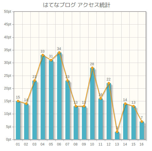
追記
$.jqplotでlegendを指定する事でLegend(凡例)を出せるが、凡例が少なくても(1以上の場合で)凡例が縦に並ぶので、それを横にしたい場合には
(function(undefined) {
  $.getJSON("/report", function(results) {
    var report = {};

    results.forEach(function(result) {
      var date = new Date(result.year, result.month, result.day);

      if (date.getTime() in report) {
        report[date.getTime()]["count"]++;
      } else {
        report[date.getTime()] = result;
      }
    });

    var ticks = new Array; // xaxisに表示するラベル
    var reports = new Array; // レンダリングするデータ

    for (var key in report) {
      ticks.push(String(report[key]["day"]));
      reports.push(report[key]["count"]);
    }

    $.jqplot("chart", [reports, reports], {
      "title": "はてなブログ アクセス統計",
      "series": [
        {
          "label": "棒グラフ",
          "renderer": $.jqplot.BarRenderer,
          "rendererOptions": {
            "barWidth": 15,
            "highlightMouseDown": false
          }
        },
        {
          "label": "線グラフ",
          "pointLabels": {
            "show": true,
            "formatString": "%d"
          }
        }
      ],
      // 追加
      "legend": {
        "renderer": $.jqplot.EnhancedLegendRenderer, // EnhancedLegendRendererでレンダリングする
        "show": true,
        "location": "s", // 場所はsouth
        "placement": "outsideGrid", // チャートレンダリング内ではない領域にレンダリング
        "rendererOptions": {
          "numberRows": 1 // 凡例をレンダリングする行数を指定。この場合1行で表現される
        }
      },
      "axes": {
        "xaxis": {
          "renderer": $.jqplot.CategoryAxisRenderer,
          "ticks": ticks
        },
        "yaxis": {
          "min": 0,
          "max": 50,
          "tickOptions": {
            "formatString": "%d件"
          }
        }
      },
      "highlighter": {
        "show": true,
        "tooltipAxes": "y"
      }
    });
  });
})();
な感じ。別途jqplot.enhancedLegendRenderer.jsを読み込んでおく必要がある
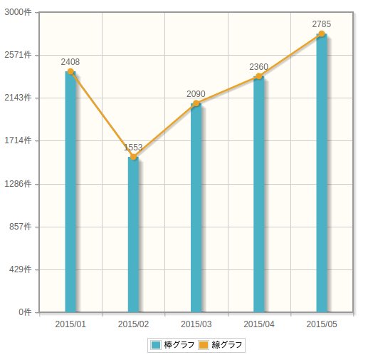
追記
上記のenhancedLegendRenderer.jsを使ったパターンをちょっと修正してスクリーンショットを取った
(function(undefined) {
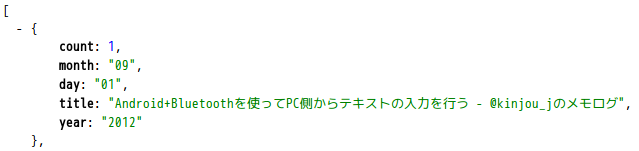
/*
データの取得結果は
[
{ year: "2015", "month": 06", "count": 100
]
のように月別でカウント総計が出るようなデータを利用
*/
$.getJSON("/report.json", function(results) {
var ticks = new Array; // xaxisに表示するラベル
var reports = new Array; // レンダリングするデータ
results.forEach(function(result) {
ticks.push(result["year"] + "/" + result["month"]);
reports.push(result["count"]);
});
var max = Math.max.apply(null, reports);
var len = parseInt("1" + Array(max.toString(10).length).join('0'));
$.jqplot("chart", [reports, reports], {
"series": [
{
"label": "棒グラフ",
"renderer": $.jqplot.BarRenderer,
"rendererOptions": {
"barWidth": 15,
"highlightMouseDown": false
}
},
{
"label": "線グラフ",
"pointLabels": {
"show": true,
"formatString": "%d"
}
}
],
// 追加
"legend": {
"renderer": $.jqplot.EnhancedLegendRenderer, // EnhancedLegendRendererでレンダリングする
"show": true,
"location": "s", // 場所はsouth
"placement": "outsideGrid", // チャートレンダリング内ではない領域にレンダリング
"rendererOptions": {
"numberRows": 1 // 凡例をレンダリングする行数を指定。この場合1行で表現される
}
},
"axes": {
"xaxis": {
"renderer": $.jqplot.CategoryAxisRenderer,
"ticks": ticks
},
"yaxis": {
"min": 0,
"max": Math.ceil(max / len) * len,
"tickOptions": {
"formatString": "%d件"
}
}
},
"highlighter": {
"show": true,
"tooltipAxes": "y"
}
});
});
})();
実行すると以下のようになる